Sunday, April 28, 2013
Unit 4 Reading
Summary:
For this week’s homework we read chapter 7 in our books and it was on designing home pages for the web. I got a lot out of this chapter, not only from the designing aspect, but the subliminal marketing aspect. This chapter went into great detail about how important designing the homepage was for any website. I particularly like that this author goes into the thought process of the user through every step of the homepage navigation. It really put into perspective for me how much affordance I should give certain aspects of my homepage design, and what things to watch out for. The Main things that deserved affordance after reading this chapter are your navigation, your tagline, where you should start on the page, and ultimately what your site is about. Any user should be able to visit the site you have his just makes it easier for people to use your site and to have people return to it again in the future. The main things this chapter told me to avoid were, well the list is too long. Pretty much design with the user in mind and make sure that everything is very easy to use and navigate and don’t have too much clutter on the page. If we do this we will design websites that have a good ROI for our clients.
Sunday, April 21, 2013
Book Promo Stuff
Book Promotion Sites:
http://www.bookbrowse.com/
http://www.booksie.com/
http://www.bookreportradio.com/
Books to Promote:
BRAIN ON FIRE, by Susannah Cahalan
http://www.susannahcahalan.com/
SIX YEARS, by Harlan Coben
http://www.harlancoben.com/novels/six-years/
GIVE AND TAKE, by Adam Grant
http://www.giveandtake.com/Home/AdamGrant
Unit 3 Reading
Summary:
Chapter 6:
What I have gotten from this chapter is that we as designers need to design in a sense that allows people to not have to browse through a site but can easily navigate it with barely looking. We want to make it so that we can have a user of the sight come to it and not have to do much thinking to get to their end result. The author goes into great depth about how each page should be consistent and look fluid so the user doesn’t get confused while trying to find what they are looking for. He even gave suggestions on what to use when designing search bars for websites and how to make them more user friendly. He provides solid examples of bad websites and gives excellent examples of what to do to not only improve them but make them easier to navigate around. He even asks what we would do to change them, in the reading before he shows us his end result. All in all what I have gotten out of this chapter is to design with the thought that people will come back to your site if it is easy to use and if it is easy to navigate and find what your trying to look for.
Saturday, April 13, 2013
Week 2 Post for Project 1
Concept Statement:
I feel like the mission for my site will be to not only show my graphic work, but to also show my photography, tattoo work, and clothing design too. I aspire to do a lot with art and I feel like when I’m marketing myself I need to portray more then just the fact that I’m a designer, I’m an all around artist. As for right now I think I will be focusing on getting most of my graphic work on the site before all of the others, just because of how much graphic work I have been doing later. I just really want people to know that I am versatile and I can work with more then just type. I want someone who needs a magazine cover done with stock photography, and not have to call in a photographer just me. I want to be that guy in my field who can do it all no matter what, and I want to create a reputation for that in the design world so people will remember that I can be called upon anything to do any job necessary. Graphic design is a huge passion of mine, but I know that clients like to see more then just graphic work. They like to know that we can create as well.
Lofi Sketches:


Lofi Wireframes:
Landing Page

Site Entrance Page

Home Page

About Page

Contact Page

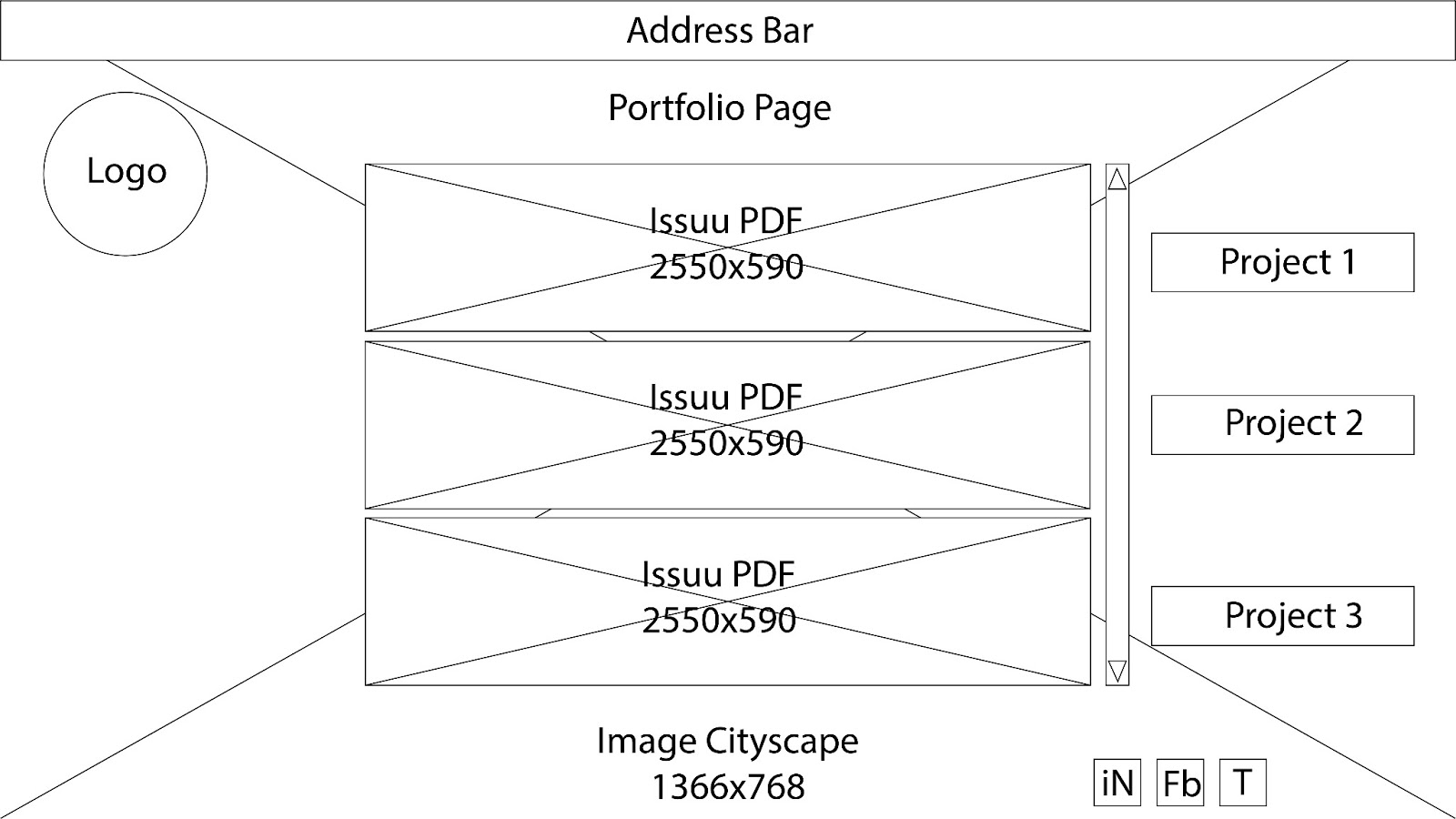
Portfolio Page
Hifi Landing page:

Can click on name to enter site
Unit 2 Reading
Summary:
Chapter 3:
What I got out of chapter three was that you need specific things to make a website work, and you have to make all of those things work together. It talked about visual hierarchy with type and graphic layout, talked about conventions and there use to make site look familiar to each other, clarity of page, affordance of buttons and how there shouldn’t be any clutter on the page. All of these things are good to keep in mind when designing anything.
Chapter 4:
Chapter 4 was a very short chapter and was about how you should make using a webpage a mindless activity for the user. It talked about how few button clicks should get you to the “end result”. The author also brought up a very good point about how three mindless clicks usually could be one super well thought out click. Depending on the site I am designing I have to choose which way to go is more appropriate.
Chapter 5:
Chapter 5 was probably my most favorite out of the three that we read for the week. It was about how people use meaningless unnecessary words while designing for the web and why not to do that. The author taught me about what happy talk really is and I thought it was quite funny. I feel like the guy just thinks everyone has no brain and it makes me laugh and hold my interest to read further.
Monday, April 8, 2013
Week 1 Hmwk for Project 1
Mood Board:

Sketches:
Inspirational Graphic Portfolio Sites:
http://35mmdesign.com/
http://leotartari.com/
http://www.bradlangdon.co.uk/
http://tebbott.co.uk/
http://www.fahadkhalid.com/
http://designspasm.net/
http://alexarts.ru/en/index.html
Unit 1 Reading
Chapter 1:
Chapter 1 in the book Don't Make Me Think by Steve Krug was pretty much an introduction to how we should think when designing websites for other users. Pretty much what i got out of it was don't make them think. A good site has a lot more to do with how user friendly and easy it is for for the user to navigate your site. Making a site that is to complicated for someone can result in them loosing interest, wasting their time, and making the company your working for look bad. SO design the site your working on with user and workload always in mind.
Chapter 2:
Chapter 2 was about the way that people actually use the internet in this day and age. It made me realize that people really don't care about all the options and what not on sites. They just care about getting to the end result quicker. Which in turn made me realize that when i do design sites i should be focusing on making it as simple as i possibly can. Doing this will make the user feel smarter and hopefully will make them want to come back and use the site i have designed. This chapter just really puts into perspective how naive people are when it comes to how much work is put into the usability of sites. Even though they might not care it should still be given credit in my opinion.
Subscribe to:
Posts (Atom)